
Laffer curve diagram
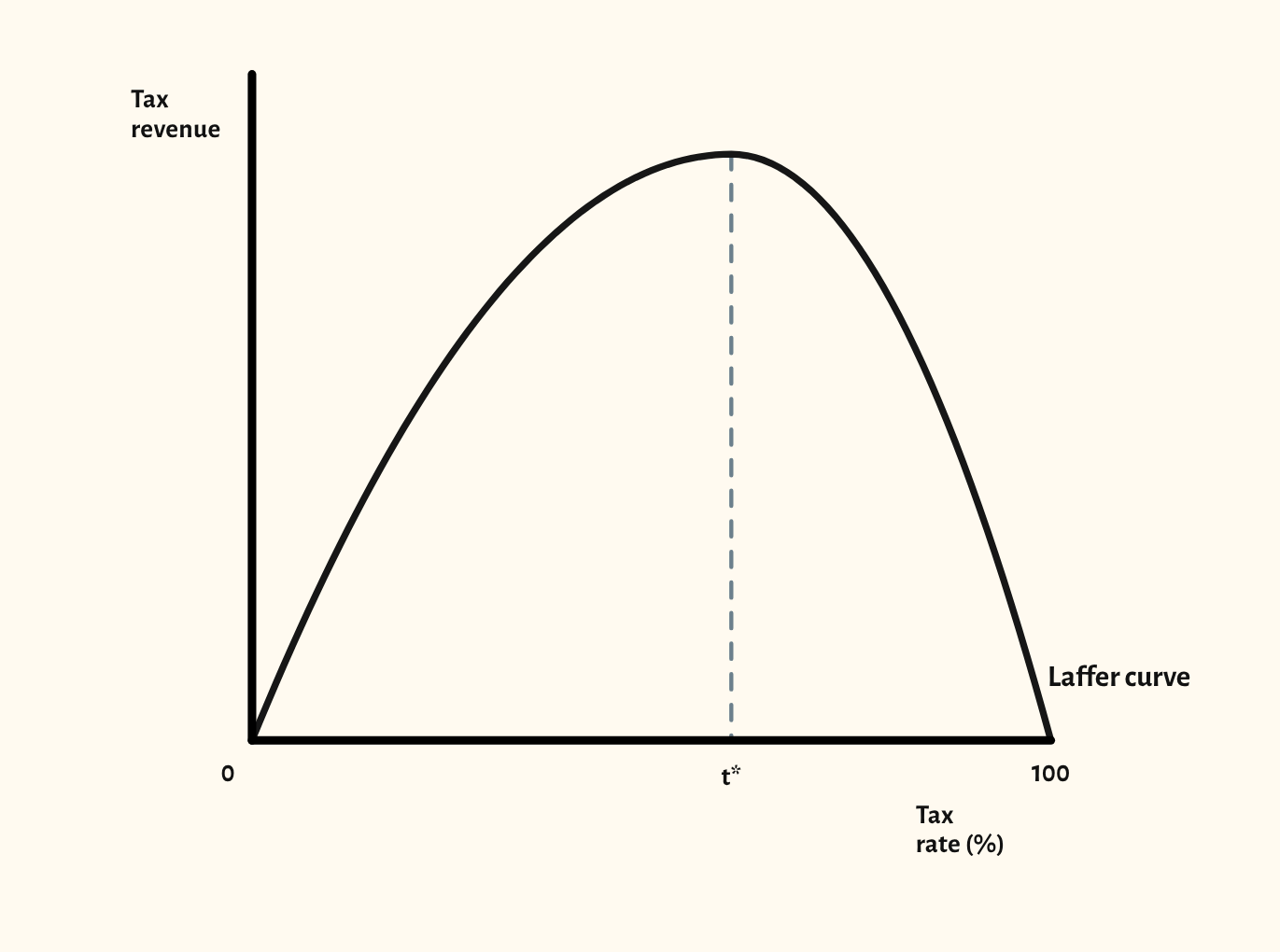
Tax revenue against the tax rate, zero at 0% and at 100%, with the revenue-maximising rate t* marked.
Open this scenario in CueCurve
Included in the school licence.
What the diagram shows
The Laffer curve shows how total tax revenue changes as the tax rate rises. At a 0% rate revenue is zero, and at 100% it is zero too, because there's no reason to earn taxable income. In between, revenue reaches a peak at some rate t*.
Below t*, raising the rate raises revenue. Above t*, a higher rate discourages work and enterprise and encourages avoidance and evasion, so revenue falls, and a tax cut could raise revenue. It's the supply-side argument for lower tax rates. The evaluation is that nobody knows where t* is for a given tax, and it differs from tax to tax and over time.
Drawing it in an exam
- Label the axes: tax rate (%) across, from 0 to 100, and tax revenue up.
- Draw the curve starting at zero revenue at 0% and ending at zero revenue at 100%, and mark the peak at t*.
- Say which side of t* the economy is assumed to be on before claiming a tax cut raises revenue.
- A common slip is leaving the axes unlabelled, which examiners have noted on this diagram.
Your exam board
Choose your board to see where this sits in its specification and what its mark schemes look for.
Edexcel A
- Specification
- 4.5.2 The Laffer curve.
- What its mark schemes look for
- Examiners keep asking for diagrams that are accurately drawn, fully labelled and used in the answer, and a top-level essay often needs an accurate diagram.
Edexcel B
- Specification
- We haven't recorded the exact specification point for this board yet.
- What its mark schemes look for
- A diagram on its own earns at most 4 of 6 marks: the answer has to explain it. Diagrams should be fully labelled, with the original equilibrium shown.
AQA
- Specification
- We haven't recorded the exact specification point for this board yet.
- What its mark schemes look for
- Short Draw questions are marked by counting labels: both axes, every curve, and the prices and quantities. No title or grid lines are needed.
OCR
- Specification
- We haven't recorded the exact specification point for this board yet.
- What its mark schemes look for
- Diagram marks are listed point by point: axes labelled, curves labelled with the right shift, and the old and new equilibrium marked.
Eduqas
- Specification
- Fiscal policy, including the Laffer curve.
- What its mark schemes look for
- The top bands reward a diagram that is accurate, well labelled and referred to in the writing. A diagram that isn't used drops a band.
WJEC
- Specification
- AS, Fiscal policy, including the Laffer curve.
- What its mark schemes look for
- Weaker answers couldn't label the axes: tax rate across and tax revenue up.
Cambridge International
- Specification
- 10.3.1 Laffer curve analysis.
- What its mark schemes look for
- The shape needn't be exact, but slopes must go the right way, curves that should meet must meet, and every curve and axis needs a label.
Edexcel International
- Specification
- 4.3.5 Laffer curve analysis.
- What its mark schemes look for
- Draw questions give a mark for labelled axes and the original curves, then marks for the change and the new price and quantity. The diagram alone can earn every mark.
With a school licence, the How often page in CueCurve lists the exam questions each board has asked that call for this diagram.
Paraphrased from published specifications, mark schemes and examiner reports. How we check
In CueCurve you can also
- Build the diagram line by line in front of the class with Step by step, so they see the order to draw it in.
- Drag the curves live and switch scenarios in one click, starting from the plain diagram each time.
- Present it full screen, draw on it with the pen, and save it into a lesson.