
Merit and demerit goods diagram
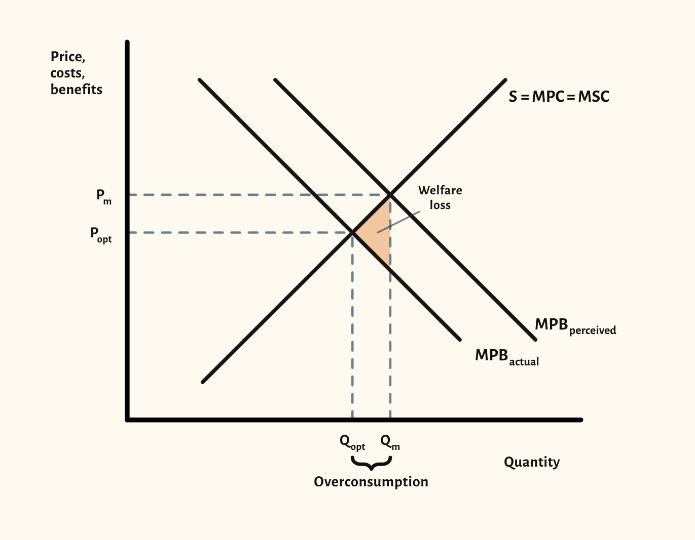
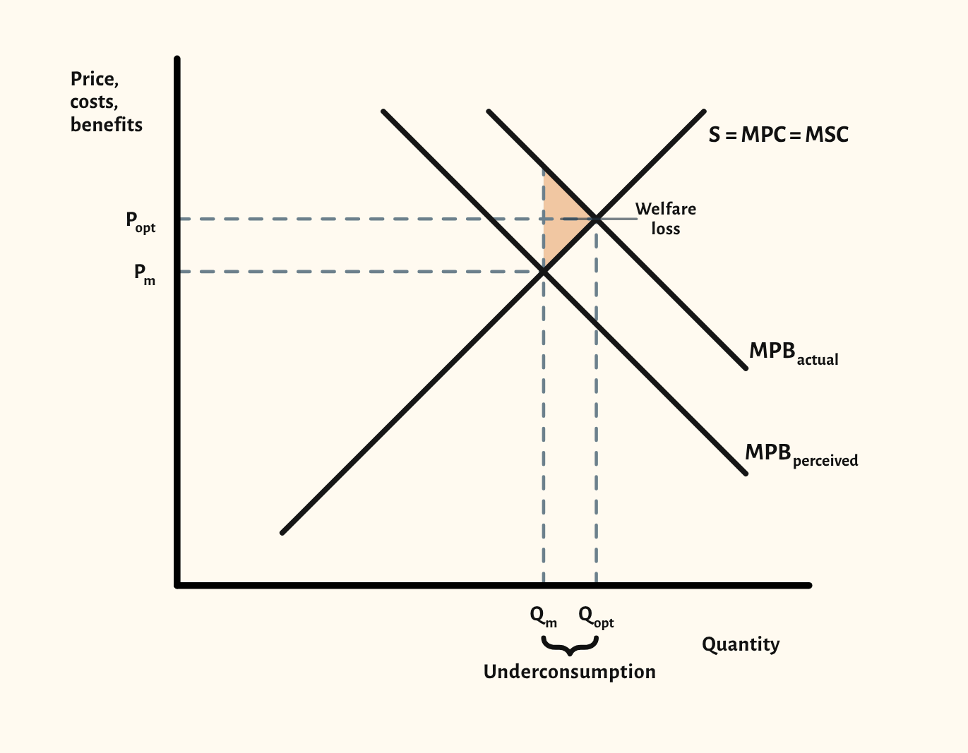
Information failure drawn as a gap between the benefit consumers perceive and the actual benefit, so the market overconsumes a demerit good and underconsumes a merit good.
Open this scenario in CueCurve
Included in the school licence.
What the diagram shows
These diagrams show market failure caused by information failure rather than an externality. Consumers act on the benefit they perceive (MPB perceived), not the benefit they actually receive (MPB actual). Supply is MPC = MSC, so there's no external cost on the diagram.
For a demerit good, such as cigarettes, perceived benefit is above actual benefit: the market produces Qm, more than the optimum Qopt where actual benefit meets supply. For a merit good, such as education or vaccination, perceived benefit is below actual benefit, so the market underconsumes. In both cases the welfare loss is the triangle between the two benefit curves and supply, between Qm and Qopt.
One more scenario
Drawing it in an exam
- Label the two benefit curves clearly, for example MPB perceived and MPB actual, so the information gap is the reason for the failure.
- Mark the market and optimum quantities and prices, and say which way consumption is wrong: overconsumption for a demerit good, underconsumption for a merit good.
- Shade the welfare loss between the curves from Qm to Qopt.
- A common slip is mixing this up with an externality diagram: an information gap is about the consumer's own benefit, so label it that way unless the question also asks about effects on others.
Your exam board
Choose your board to see where this sits in its specification and what its mark schemes look for.
Edexcel A
- Specification
- 1.4.2 Information gaps.
- What its mark schemes look for
- Examiners keep asking for diagrams that are accurately drawn, fully labelled and used in the answer, and a top-level essay often needs an accurate diagram.
Edexcel B
- Specification
- We haven't recorded the exact specification point for this board yet.
- What its mark schemes look for
- A diagram on its own earns at most 4 of 6 marks: the answer has to explain it. Diagrams should be fully labelled, with the original equilibrium shown.
AQA
- Specification
- 4.1.8.5 Merit and demerit goods, including diagrams of their consumption.
- What its mark schemes look for
- Short Draw questions are marked by counting labels: both axes, every curve, and the prices and quantities. No title or grid lines are needed.
OCR
- Specification
- 2c.2.9 Market failure caused by information failure, with a diagram.
- What its mark schemes look for
- Diagram marks are listed point by point: axes labelled, curves labelled with the right shift, and the old and new equilibrium marked.
Eduqas
- Specification
- Market failure: diagrams showing information asymmetries.
- What its mark schemes look for
- The top bands reward a diagram that is accurate, well labelled and referred to in the writing. A diagram that isn't used drops a band.
WJEC
- Specification
- Market failure: diagrams showing information asymmetries.
- What its mark schemes look for
- Axes must be labelled for the market in the question, and a question that asks for 'diagrams' expects more than one.
Cambridge International
- Specification
- We haven't recorded the exact specification point for this board yet.
- What its mark schemes look for
- The shape needn't be exact, but slopes must go the right way, curves that should meet must meet, and every curve and axis needs a label.
Edexcel International
- Specification
- Unit 1, imperfect market information: information gaps.
- What its mark schemes look for
- Draw questions give a mark for labelled axes and the original curves, then marks for the change and the new price and quantity. The diagram alone can earn every mark.
With a school licence, the How often page in CueCurve lists the exam questions each board has asked that call for this diagram.
Paraphrased from published specifications, mark schemes and examiner reports. How we check
In CueCurve you can also
- Build the diagram line by line in front of the class with Step by step, so they see the order to draw it in.
- Drag the curves live and switch scenarios in one click, starting from the plain diagram each time.
- Present it full screen, draw on it with the pen, and save it into a lesson.